Introduction
Gnuplot is a nice tool to create graphics. However, sometimes, we need more specific functionalities we may think Gnuplot does not have. A deeper look into Gnuplot functionalities show us that it is a very powerfull tool!
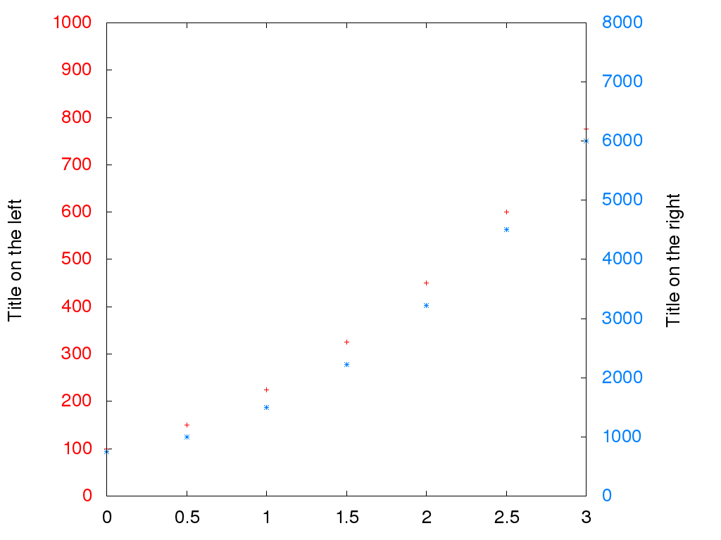
Yesterday, I needed to create a graphic with 2 curves on it. The problem is that the first is below 1000 and the other may be over 5000. I need a two scales graphic with one scale on the left and the other scale on the right. How do we do that on Gnuplot?
What we want?
There is 2 datasets that we want to display on the same graphic. The scale of the two datasets would be different. Consequently, we will have a left axis with different label and tics than the right axis. Moreover, we will use different color in order to associate each axis to each curve: red for the left axis (with the first curve) and blue for the right axis (and the second curve). Finally, we will hide the legend since the colors should be enough to understand the datas.
Configure the first part of the graphic
The first part of the graphic is the basic part you would expect from a graphic: a left scale with a label and tics.
set yrange [0:1000];
set ylabel "Title on the left";
set ytics 100 nomirror textcolor lt 1;
First of all, we define the lower and upper bound of the first ordinate curve.
The second point is to set the title of the axis. Finally, we specify the
number of tics (each 100 units in this case). For this last step, we also
specify the color of it because we want a red color for the left axis. The
nomirror option specify that we want the tics only on the left axis (no
mirrored tics on the right axis).
Configure the second part of the graphic
We will do nearly the same for the second graphic. The only thing to know is
that for each y<something> option, there is also a y2<something>
corresponding option for the right axis.
set y2range [0:8000];
set y2label "Title on the right";
set y2tics 1000 nomirror textcolor lt 3;
Note the change in the color of tics.
Hide the legend
Hiding the legend in Gnuplot is easy… as long as you know how the option is called!
unset key;
Drawing the plots
To draw the plots, we use the plot function. Most of the time, if you want to
draw to curve on the same graphic, that’s because they have the same dataset in
abscissa. That’s mainly imply that all the data are in the same file with
more than 2 columns. For example, a file like this.
time	left	right
0.00	100.0	750.0
0.50	150.0	1000.0
1.00	225.0	1500.0
1.50	325.0	2225.0
2.00	450.0	3225.0
2.50	600.0	4500.0
3.00	775.0	6000.0
In Gnuplot, we can load a multicolumns data file and choose which column to
display on which graphic. This is how we will plot our data which are stored in
the file data.csv.
plot \
	"data.csv" using 1:2 linetype 1, \
	"data.csv" using 1:3 linetype 3 axes x1y2
We give the name of the file to the plot function. Then we specify the
columns to use (always the first in this case since it is our abscissa). We
also change the color of the curve with the linetype option. The last
important thing is to specify which axis (and which scale) to use for which
curve (x1y1 is the default).
Bonus: export as a file
To export your Gnuplot result as an image file, you need to add at the beginning of the script the following lines.
set terminal png size 1024,768 enhanced font "Helvetica,20"
set output 'output.png'