This post is part of an ongoing series about tests in Rust:
-
Make it look like rainbows 🌈
What can we do to improve the reporting?
In the previous post, we ended up with the following report when running tests.
stderr:
thread 'main' panicked at '
runit-assertions/src/lib.rs:66
    ✓ should be not equal to `0`, was `42`
    ⨯ should be not equal to `42`, was `42`
'
This is already nice but can we improve on that? First of all, it be real nice to color it. How about we use red/green colors to quickly identify which tests failed?
Colors in the terminal
To display colors in the terminal, I searched for a crate with the keyword color in crates.io (see link). [1]
A few of them showed up and all are done by known people [2] in the community:
-
ansi_termby Josh Triplett (owner oncargo) and Benjamin Sago (author ofexa) -
termcolorby Andrew Gallant also know asBurntSushi(prolific author of at leastregex,csv,ripgrepto name only a few) -
termby Alex Crichton (owner oncargo), Huon Wilson and Steven Allen -
consoleby Armin Ronacher (which I’ve known throughcargo-insta) and Pavan Kumar Sunkara
Ok, that is a lot of dropped names but that is also a way for me to thank them. I’ve known by name most of them, interacted with some of them. But for sure, all of them brought a lot to the Rust ecosystem: thank you.
Now, which one to choose? To be honest, I’ve picked the most downloaded one:
ansi_term. It’s not the most recently updated (ansi_term: 2 years,
termcolor: 1 year, term: 1 year, console: 4 months) but it is the most
downloaded one by about 15 millions. In any case, it should not be to
difficult to change for another one if that was necessary so I’m not spending
too much time thinking about it.
Additional note, most of these libraries basically brings colors but also bold, underlined and a few other stylish stuff.
Let’s make it green and red
First of all, I’m not gonna get through code here because it’s not really
interesting. The only technical part worth mentioning is that I’ve made
ansi_term an optional dependency, although part of the default features.
This means that I want colored output to be part of the default provided
behavior of runit… but people should be able to suppress that if they
believe it’s just fancy and add too much to the building time (even if it’s
probably going to be test building).
First iteration
Very simple start. How about this?

Some colored checkmarks or crosses with a flashy green and red color. On top of that, some bold fonts for the location. Pretty good already, right? We can do more.
Second iteration
How about we highlight more the failed tests and make the passed tests a bit more discrete.

Now, the entire background’s line is colored. The failed tests are more flashy with bold, whereas the passed tests use a more pastel color with normal font.
Can we do more? Let’s try!
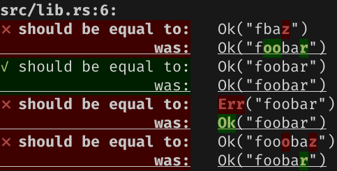
Third iteration
The inspiration for this third iteration is purely inherited from
pretty_assertions.

First of all, compared values are aligned to ease the comparison. I also used
a diffing algorithm thanks to
dissimilar to precisely show the
difference between the strings. I you’re interested in the details of how
complex that nice feature was to implement, it’s only about
27 lines of code.
dissimilar is really pulling all the hard work for us.
Since the output is now on 2 lines, I’ve underlined some lines to create a separation between each assertion.
I like this last rendering… although, there is a bunch of problems with it.
Problems to address later
When I worked on these features, I worked head-on on the coloring improvement.
Now that it’s done, I can take a step back and think a bit. So far, I’ve been
exploring the rendering of only is_equal_to (and its friend
is_not_equal_to). But the plan always was to expand to more assertions.
What good is going to be a diff output for something like is_greater_than?
Yeah, you’re right, it doesn’t make any sense.
How about if we start using regular expression and have a matches assertion?
Or asserting on a map with has_key or contains?
And I’m sure I could find thousands of these little examples where a diff would
not make any sense. It feel like a diff is only useful when comparing for
equality which is exactly what PartialEq is about.
Let’s pin these and we’ll try to address them on a later post. One thing that
seems to emerge is that the reporting is tightly coupled with the assertion.
In term of code architecture, it probably means that the current version, that
you can find on
woshilapin/runit,
is not well-suited for what’s coming.